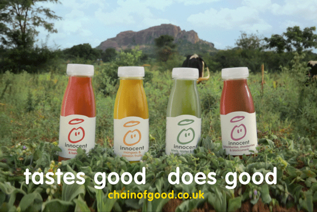
The slogan "tasted good, does good" will make this product appealing to the public as it will convince them that they will be able to get good nutrition and one of their 5-a-day also with the experience of a great tasting drink. The background contains an image of agricultural grounds. This is used to illustrate to the public that the ingredients in the product are fresh from nature and it doesn't contain any artificial colours or flavouring. The halo in the logo also is in place to remind us of how "innocent" the product is.
Sunday, 18 February 2018
General The type of people that read Reveal is on average between 18-35 years, that are mainly female. Mostly the readers are of working classes (C1, C2, D, E)
The editor introduces Reveal as the readers "best friend" as it shares gossip, fashion and makeup advice etc. This magazine is very relatable to the reader and it includes things to keep the readers interested Tatler strives to present its magazines towards the upper class and more "posh" audiences from the ages 20 and above. However, Reveal aims for the working class and "regular Londoners" as it is more relatable to their life. The audience is also the between the ages 18-34. Tatler aims for educated people compared to Reveal. Reveal readers tend to be interested in celebrities gossip and the latest things happening amongst the more famous people. From the other Reveal magazines, I can tell that they are strongly interested in mishaps that occur in celebrities lives. Media language Reveal is most popular for its collage layout and grabbing cover lines. On the covers of Reveal, they feature Flash/ sell lines that instantly draw the reader in and make hem want to read more of the magazine where it goes into depth. The covers also feature name checks, this is highly used throughout their covers. Using well know and familiar celebrity names will cause the public to want to read it as they already have knowledge of these familiar names. Reveals colour scheme is mainly red, yellow and pink. These colours will stand out and catch the eyes of the public. San serif fonts are used throughout the covers of Reveal, this offers a more modern feel and it makes it seem informal or casual which fits well with a gossip magazine. Some of the cover lines include snappy and short lines that a give a few details into the story. Some of these cover lines do not give that much insight into the speculation but just enough to make the public want to purchase the magazine in order to read the full story. Colour scheme is a big part of the magazine. Colours such as red, pink and yellow are used. Red is the main colour used throughout. The colour red usually relates to boldness and passion which could mirror the contents of the magazine. The images used are shots taken by paparazzi. The images are sometimes positioned with other ones to change the perspective of things. Sometimes the magazines will make celebrities look like they are conflicting or in the middle of an argument; when in reality, they are not. Tatlers design is more sophisticated and professional, which is highlighted by the Serif fonts and the organised covers whereas Reveal is has a more casual and modern feel. Representation The type of people represented on the cover celebrities that are well known amongst society due to their constant downfalls or achievements that cause them to make an appearance in the news or magazine. Personally, I believe that this cover doesn't necessarily highlight any stereotypes. Reveal slightly breaks the stereotype put among the celebrities. People usually believe that the lives of celebrities are very simplistic and unproblematic causing them to feel that they cannot relate to the lives of celebs. However, Reveal includes factors that completely destroy that stereotype. Reveal wants the readers to feel as if they can relate to the situations that the celebrities are going through. Reveal wants the reader to remember that celebrities are regular people to and they experience things just the same way that we all do too. Social and cultural context In Tatler, the producers don't really tend to document on situations that deal with topics such as relationships, sex, or the domestic lifestyle. However, within Reveal, common topics (such as the ones I mentioned) are openly discussed and written about. The cover lines could suggest that Reveal readers are mainly women that have to go through the ups and downs of pregnancy, potentially relationship issues also. Reveal sometimes offers guidance on weight loss or weight gain to support the readers on the way to reach their ideal weight or figure.
instead of choosing 3 covers, I decided to choose 8. The reasoning behind this is that most of Reveal's covers have a running theme throughout. The key reoccurring themes between these 8 covers are motherhood, marriage, families and relationships. These themes make an appearance in almost every one of the Reveal magazines.
These three magazines all have one thing in common -Cheryl Cole. She has appeared numeral times on Reveal covers, each with a different story to be told. A reason for this is that it could attract the public to purchase the magazine. As you probably already know, Cheryl is a very big celebrity amongst the UK. Her music listened to by millions and her appearance on X Factor (as a judge) has made her fanbase rise. Reveals choice to put Cheryl featuring in the magazine will cause profits to rise considerably as more of the UK will be interested to know the latest events in her life. Not just Cheryl though, other well-known celebs have been used on the covers of Reveal.